FLASH: www.yogabbagabba.com
HTML: www.freitag.ch
 |
| Yo Gabba Gabba cast, including guest star Jack Black |
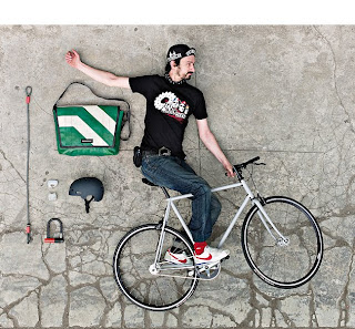
For my HTML site, I went with Freitag. This company makes bags and multiple accessories out of truck tarps, seat belts, bike inner tubes, recycled airbags and so on. A pretty genius operation if you ask me. The materials are cheap for them, they are tough and sturdy and the final product is nothing short of epic.
Out of the two, if I were to choose one I liked better, I would have to go with Freitag's, though, it would be very, very close between the two. Why you ask? Well, there are many reasons. First, their business model and products are genius and if I had the money I would purchase the entire stock, no questions asked. Next the design of the site is simple, yet sophisticated in it's functionality. They are not afraid of white space either, so it's not overwhelming to view and explore. Also, the site, in most places, engages the viewer and encourages interaction and participation.
Navigating the through Freitag's site is simple. Tabs for each section are located at the top of the screen and become active as they are scrolled over. With just one form of navigation, and plainly laid out, there is not any chance of confusion about how to find information for products or purchase products. At the top of the page the tab you are currently viewing switches from green to black, to let the viewer know exactly where they are in their journey.
Color, texture and motion are brought to life in the "Online Shop," section of the site. After selecting a product line, as the mouse scrolls over the different options and styles within that line, a dark figure is shown to the left with whatever product the mouse rolls over, showing whether it is intended for a male, a female or to give an idea of general size of the product when being used. Once a style is selected, all the available products within that particular style appear in a box, in an array of colors and all are varied in color, given that no two bags are made alike because many tarps are used. Having chosen a particular product, the product is zoomed in on, using Flash and a 360 degree viewing of the product is then available, while additional information is available on the outside of the box, to the left.
The largest display of visual, informational or any other type of hierarchy is portrayed in buttons for the "Shopping Cart," or "Favorites," for the products, etc. And for the most part, things are mostly equal in hierarchy and consistent in terms of typeface remaining the same throughout. What gives the site it's strength is it's product, as I previously stated, but also the powerful imagery of the merchandise the merchandise's ability to be viewed well, the combination of the textual and visual nature of the site itself and it's overall simplicity in general. The simplicity is HUGE. The site itself is clean and neat and done in with a grid in the background in places; very neat and orderly, allowing all the attention to go straight to the product and really making the product "pop."
To say that the site is pushing toward a certain demographic might only be partially true. While the company's bags and other products might more readily appeal to a designer/hipster/indie/etc. crowd, some of the newer product could go right in the closet of your mom and dad–and not in a nerdy way. The site successfully goes across the board to appeal to just about anyone who has good taste in rad accessories and bags, young and old, though chances are, those 12 and below might not be entertained enough to stick around and appreciate all that is offered both from the website and the product line.
I've said enough. Now go check it out!

No comments:
Post a Comment